
What spot Bitcoin ETF holdings reveal
Spot Bitcoin ETF holdings track the actual Bitcoin stored in custodian wallets, distinct from the ETF share price. Issuers like BlackRock and Fidelity purchase BTC on exchanges and store it in digital wallets managed by custodians. This creates a real-time ledger of institutional accumulation or distribution that public market reports often miss.
Traditional fund flow reports often lag or aggregate net purchases, masking the timing and volume of large institutional moves. On-chain data provides granular visibility into daily flows in BTC, offering a clearer picture of sentiment. By monitoring these custodial wallets, investors can see exactly how much Bitcoin is being absorbed by ETFs versus how much is being sold off.
This transparency is vital for understanding market dynamics. While ETF prices fluctuate based on trading activity, the on-chain holdings reflect the actual supply pressure. Tracking these flows helps distinguish between speculative trading and genuine long-term institutional adoption.
Reading Daily Net Inflows and Outflows
Spot Bitcoin ETF holdings provide a daily pulse on institutional capital movement. These numbers represent the net change in Bitcoin held by major ETFs like BlackRock’s IBIT and Fidelity’s FBTC. A positive number indicates net inflows, meaning more Bitcoin was purchased than redeemed. A negative number signals outflows, where investors are selling or switching positions.
Interpreting these daily swings requires separating passive accumulation from active trading pressure. Passive accumulation occurs when long-term holders or institutional mandates add Bitcoin steadily, regardless of short-term price volatility. This creates a baseline of demand that supports the asset’s floor. Active trading pressure, by contrast, reflects shorter-term reactions to market news, macroeconomic data, or technical chart levels. These flows can be volatile and often reverse quickly.
To distinguish between the two, look for consistency over time rather than reacting to a single day’s data. Sustained inflows over weeks or months typically signal genuine institutional adoption and long-term conviction. Sharp, isolated spikes in outflows may indicate profit-taking or risk-off sentiment but do not necessarily reflect a loss of confidence in the asset class.
The chart below illustrates the relationship between price action and volume for a leading spot ETF. It helps visualize how trading volume correlates with significant price movements, offering context for the holdings data discussed above.
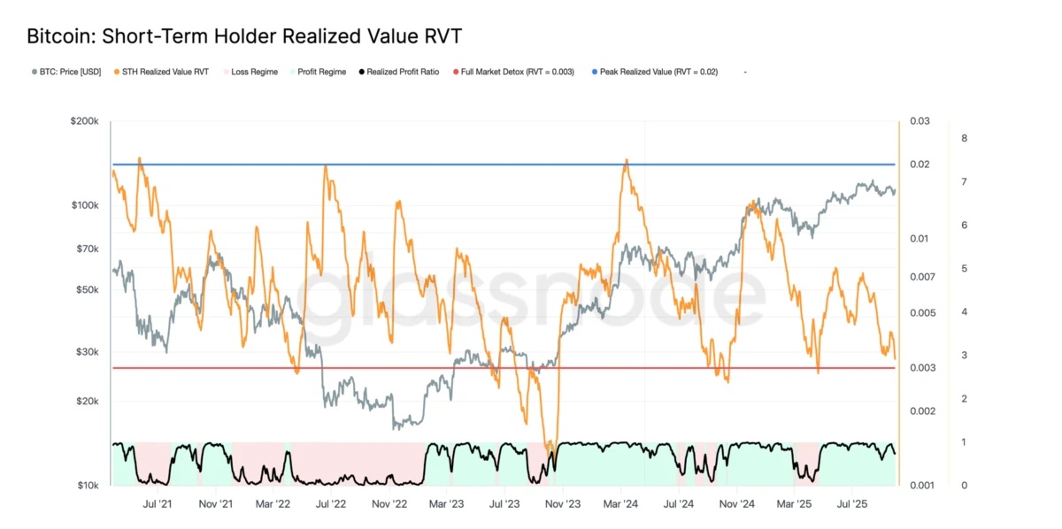
Bitcoin ETF data is better suited for identifying medium- to long-term capital trends rather than serving as short-term trading signals. Use these metrics to confirm broader market sentiment, not to time individual entry or exit points.
Comparing Major Spot ETF Issuers
Tracking institutional flows requires identifying which issuers hold the most assets and attract the most daily capital. The spot Bitcoin ETF market has consolidated around a few dominant players, with BlackRock and Fidelity controlling the vast majority of the sector. Grayscale, while historically significant, has seen its market share shrink as investors migrate to lower-cost alternatives.
The table below compares the top issuers by Assets Under Management (AUM), expense ratio, and recent 30-day net inflows. These metrics reveal the current hierarchy of institutional preference.
| Issuer | AUM (Billions) | Expense Ratio | 30-Day Net Inflows |
|---|---|---|---|
| BlackRock (IBIT) | 45.2 | 0.25% | $1.8B |
| Fidelity (FBTC) | 22.1 | 0.25% | $850M |
| Grayscale (GBTC) | 18.5 | 1.50% | -$2.1B |
| ARK 21Shares (ARKB) | 4.2 | 0.21% | $120M |
| VanEck (HODL) | 2.8 | 0.25% | $95M |
BlackRock’s IBIT has become the de facto standard for institutional exposure, leveraging its massive distribution network to capture over half of all ETF assets. Fidelity follows as a strong second, appealing to traditional wealth management clients. Grayscale’s GBTC, once the pioneer of the space, now struggles with its high fee structure and the ongoing outflows from its conversion to an ETF.
For investors tracking these flows, the expense ratio is a critical differentiator. While 0.25% may seem small, it compounds significantly over time. Newer entrants like ARK 21Shares are competing on price, offering slightly lower fees to attract cost-sensitive capital.
The chart above shows Bitcoin’s price action, which serves as the underlying benchmark for all these ETFs. While the ETFs track the spot price, their AUM and flow data provide a layer of institutional sentiment that the raw price alone does not reveal.
Timing Entries and Exits with ETF Flow Data
ETF flow data provides a clear view of institutional accumulation, but it is not a crystal ball for short-term price movements. The metrics track the structural shift of capital into regulated vehicles, reflecting long-term demand rather than daily trading noise. Using this data for tactical timing requires understanding its inherent lag and the broader context of market sentiment.
The Lag of Institutional Flows
ETF inflow data is reported after the fact, meaning it reflects decisions made by asset managers based on previous day’s client requests. By the time net inflows appear in on-chain datasets, the immediate buying pressure has often already occurred. Relying on this data for same-day entry or exit signals can lead to chasing momentum rather than anticipating it. Instead, treat these flows as confirmation of trend strength rather than a trigger for immediate action.
Distinguishing Signal from Noise
Spot Bitcoin ETFs are designed for long-term holding, not high-frequency trading. Consequently, daily flow data can be volatile and misleading when viewed in isolation. A single day of net outflows does not necessarily indicate a bearish shift, just as a day of inflows does not guarantee a rally. Analysts should focus on multi-week or quarterly trends to identify genuine structural demand. This approach filters out the noise of retail speculation and highlights the steady accumulation by institutional portfolios.
Integrating Price Action
To effectively time market entries, ETF flow data should be combined with price action analysis. When consistent inflows coincide with price stability or gradual appreciation, it suggests healthy, sustainable demand. Conversely, if inflows stall while prices remain elevated, it may signal weakening conviction. For real-time context, monitor current market conditions alongside these structural metrics.

No comments yet. Be the first to share your thoughts!